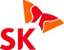
SK's New Logo, Symbol Mark
The group adopts happy management and 'happy wings'to signify its passion and pride
 SK Group has developed a new logo and symbol mark to signal its effort to realize a new management ideal, "happy Management" and expand its global market.
The group has been after the development of a new logo in line with its new management based on seeking "Happy Management"and to create a new brand identity, following its make up of a new management system designed for a joint network of ownership of brand and entrepreneurial culture. The group also made a new symbol mark dubbed, "Happy Wing"to strengthen the legal protection of its brands as its global market expands.
The new symbol mark has as its motive a communication satellite and two wings symbolizing the two basic business sectors of the group; one petrochemical and the other information and communication. It reflects the supex spirit flying toward the global market. Kwon O-young, managing director of the SK Corporate Culture Office, said red for happiness and orange color for attractiveness have been adopted to for letters S and K to show a softer image for the group to accentuate SK's core value: happiness and customer-oriented intention.
The new logo and the corporate symbol mark will be used from November in connection with the Visual Identity improvement project, which has been pursuing by the affiliates of the group led by SK Corp. and SK Telecom.
Lippincott Mercer, world-famous corporate identity maker, has been assigned to come up with the new logo and corporate symbol mark. Their brand rights were applied in 107 countries in the world including Korea. nw
3Fl, 292-47, Shindang 6-dong, Chung-gu, Seoul, Korea 100-456
Tel : 82-2-2235-6114 / Fax : 82-2-2235-0799